
لوحة الألوان والمواد
كيف تبني تصميماً داخلياً معاصراً حول ترافرتين رومانو
تعامل مع ترافرتين رومانو البيج الدافئ كمحايد معدني للغرفة، ثم تحكم في الدرجات اللونية عبر الدهان والخشب والمعدن والجراوت والإضاءة بحيث تبدو المساحة متعددة الطبقات بدلاً من الاصفرار.
استراتيجية اللوحة
اقرأ الدرجة اللونية قبل اختيار الدهان
ترافرتين رومانو ليس كريمياً مسطحاً. أرضيته البيج الدافئة قد تشمل درجات القش والرمال والبيج الغامق والرمادي الناعم، بينما تخلق المسام الطبيعية نقاط ظل أغمق. تحت إضاءة 2700K يصبح أكثر دفئاً وذهبية؛ تحت ضوء النهار البارد يبدو أكثر هدوءاً ومعدنية. تبدأ اللوحة الناجحة بفحص دفعة اللوح الفعلية بجانب الدهان والخشب المقترحين—وليس صورة ويب صغيرة.
أسهل نهج معاصر هو ترك الحجر يحمل النمط والحفاظ على التشطيبات المحيطة مضبوطة. اختر أبيض دافئاً بدرجة لونية متوافقة، وكرر درجة لون متوسطة من الحجر في التنجيد أو الجص، وأدخل التباين عبر الفحم أو البرونز الداكن أو الجوز في مناطق محدودة. لون الجراوت والحشو مهم بقدر أهمية دهان الجدران لأنهما يقعان مباشرة بجانب الحجر.
بناء اللوحة
تركيبات تعتمد على الحجر للجدران والأرضيات والأثاث
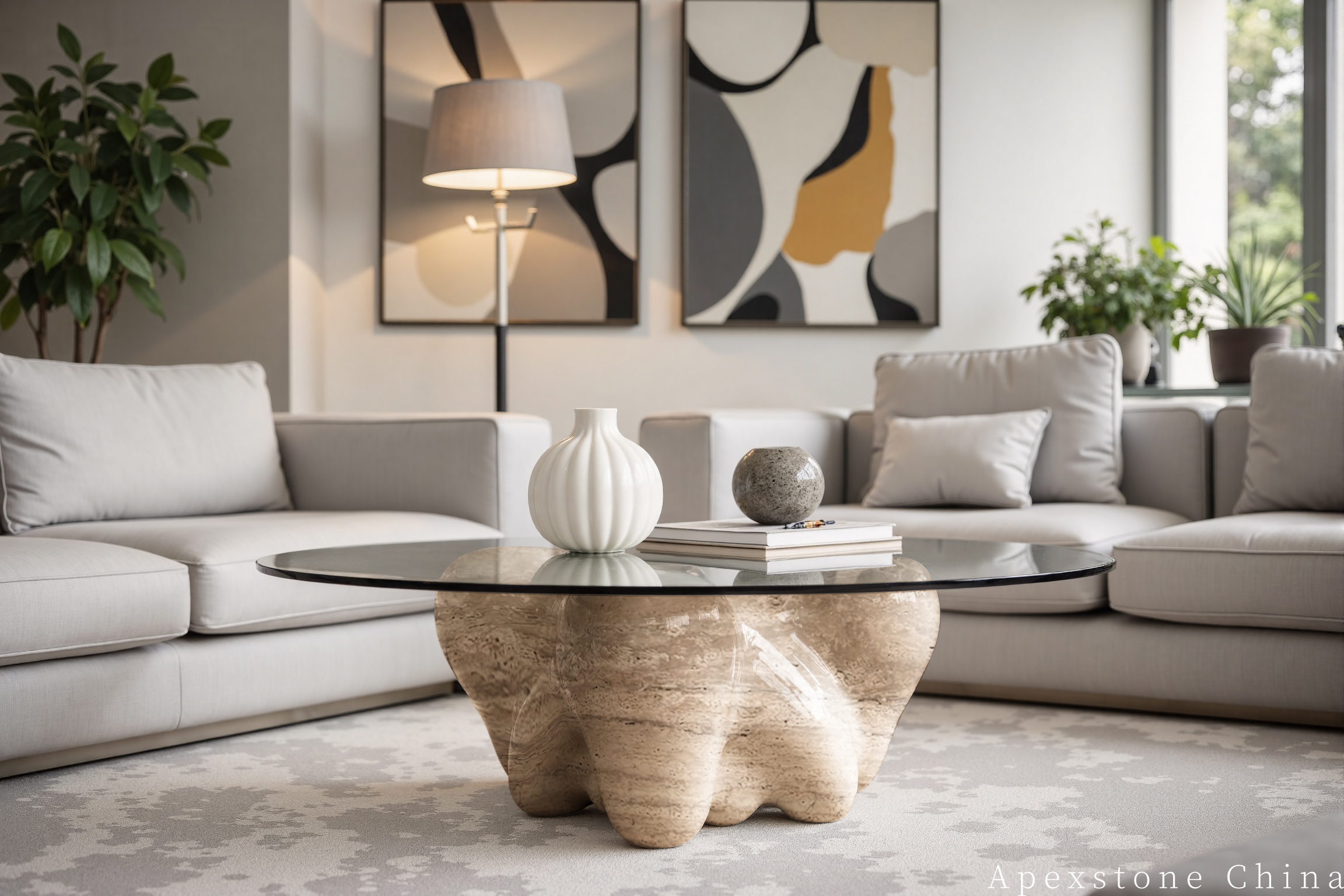
استخدم النطاق الكامل للوح—من الكريمي الفاتح إلى ظل البيج الغامق—لإنشاء لوحة مواد مترابطة.
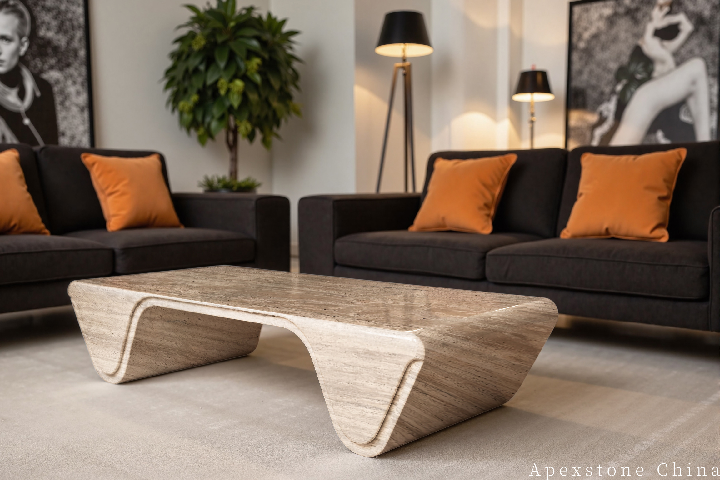
Warm Stone & Black
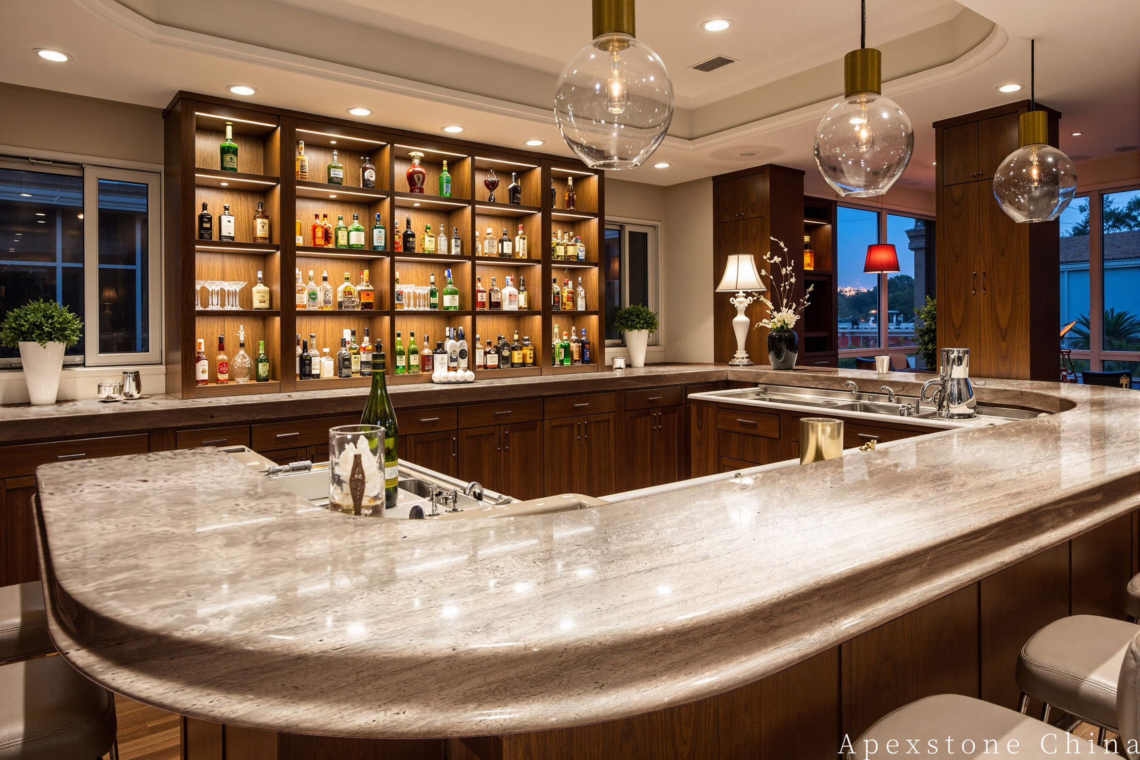
Stone & Dark Timber
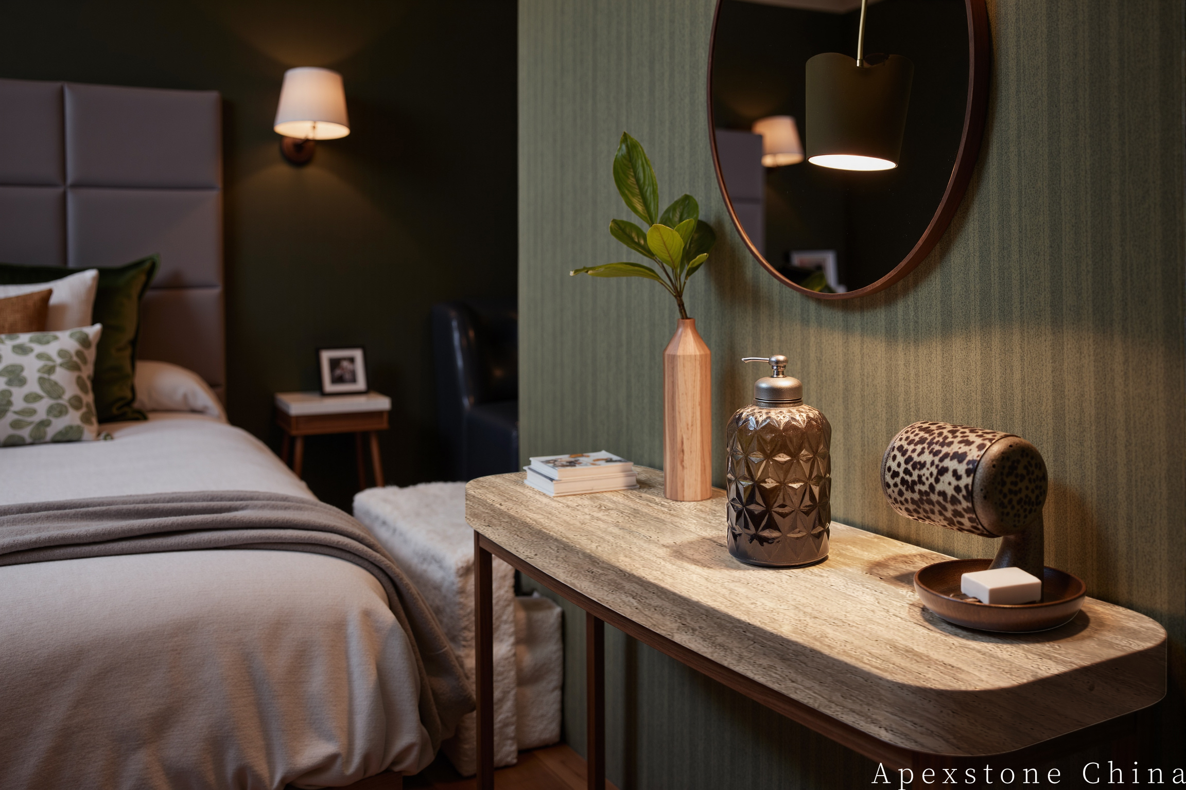
Olive & Walnut
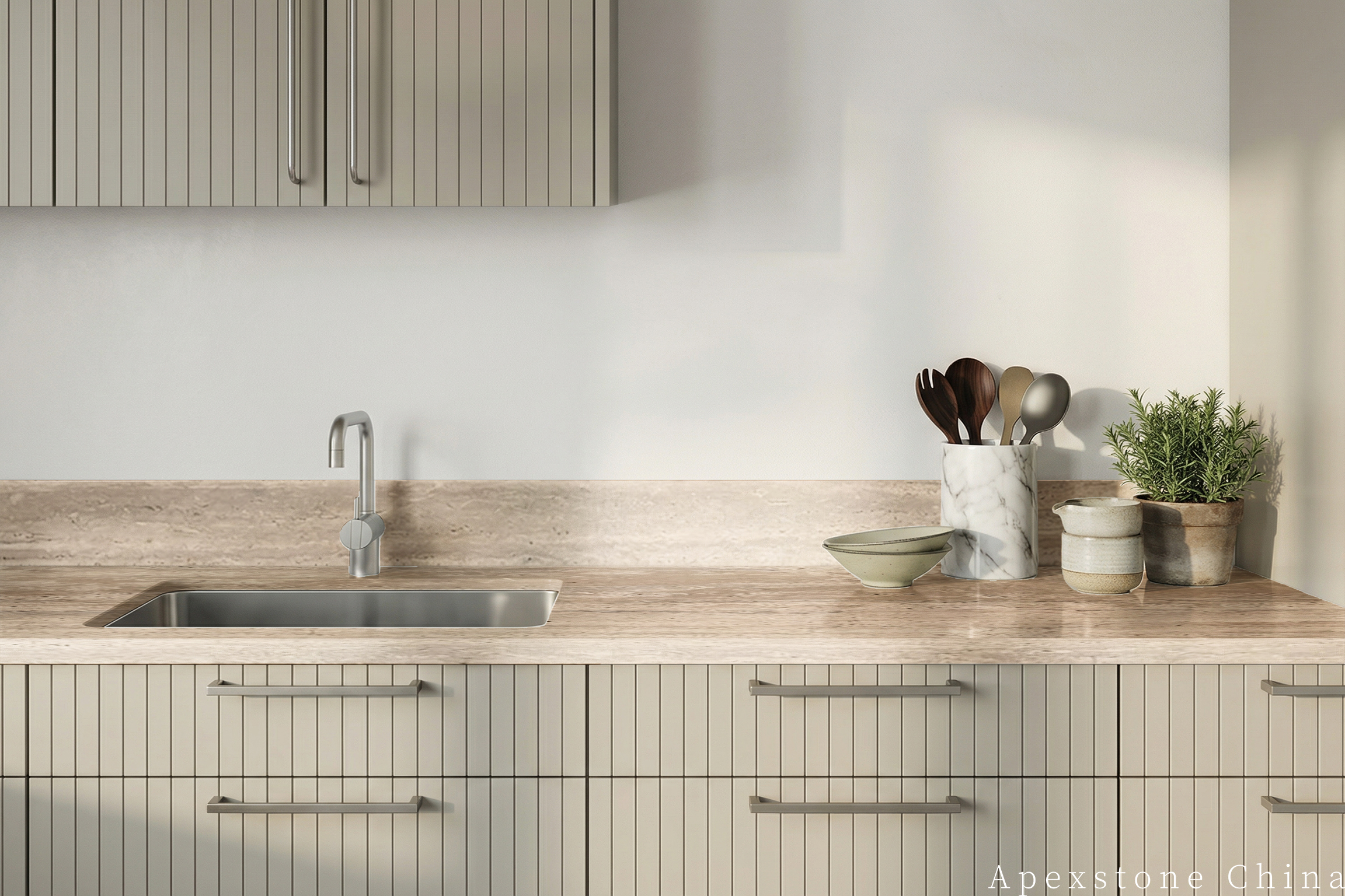
Greige Minimal
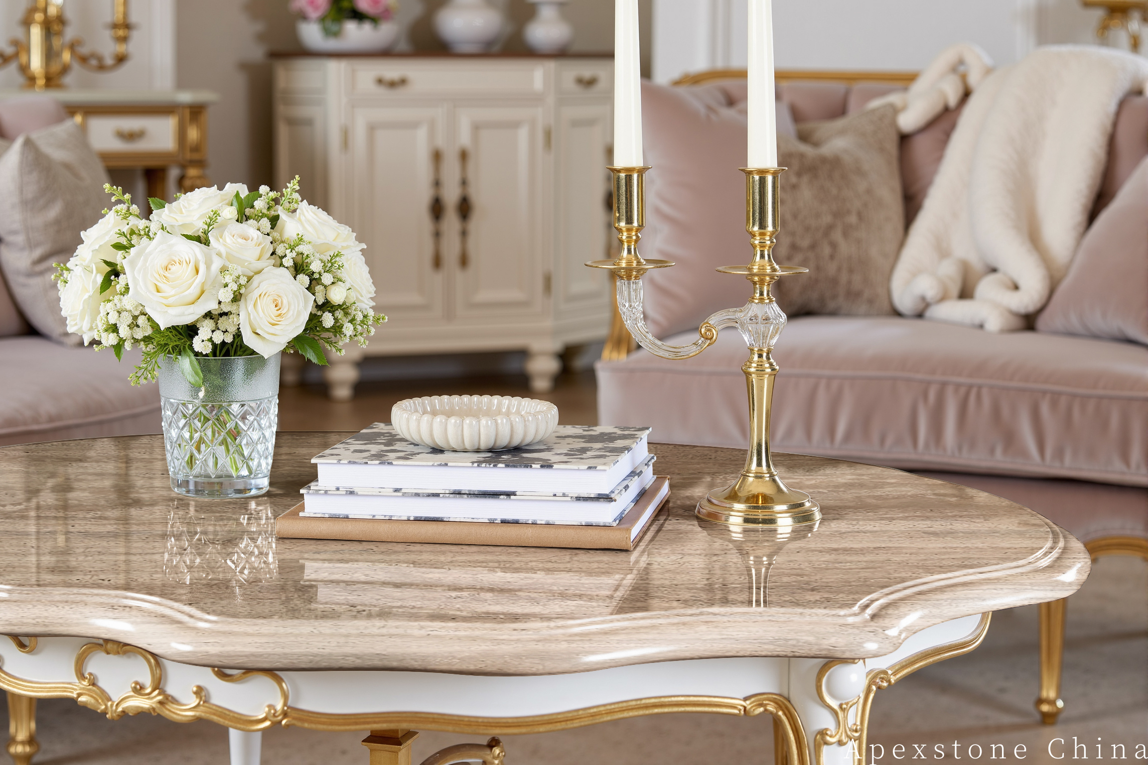
Blush & Brass
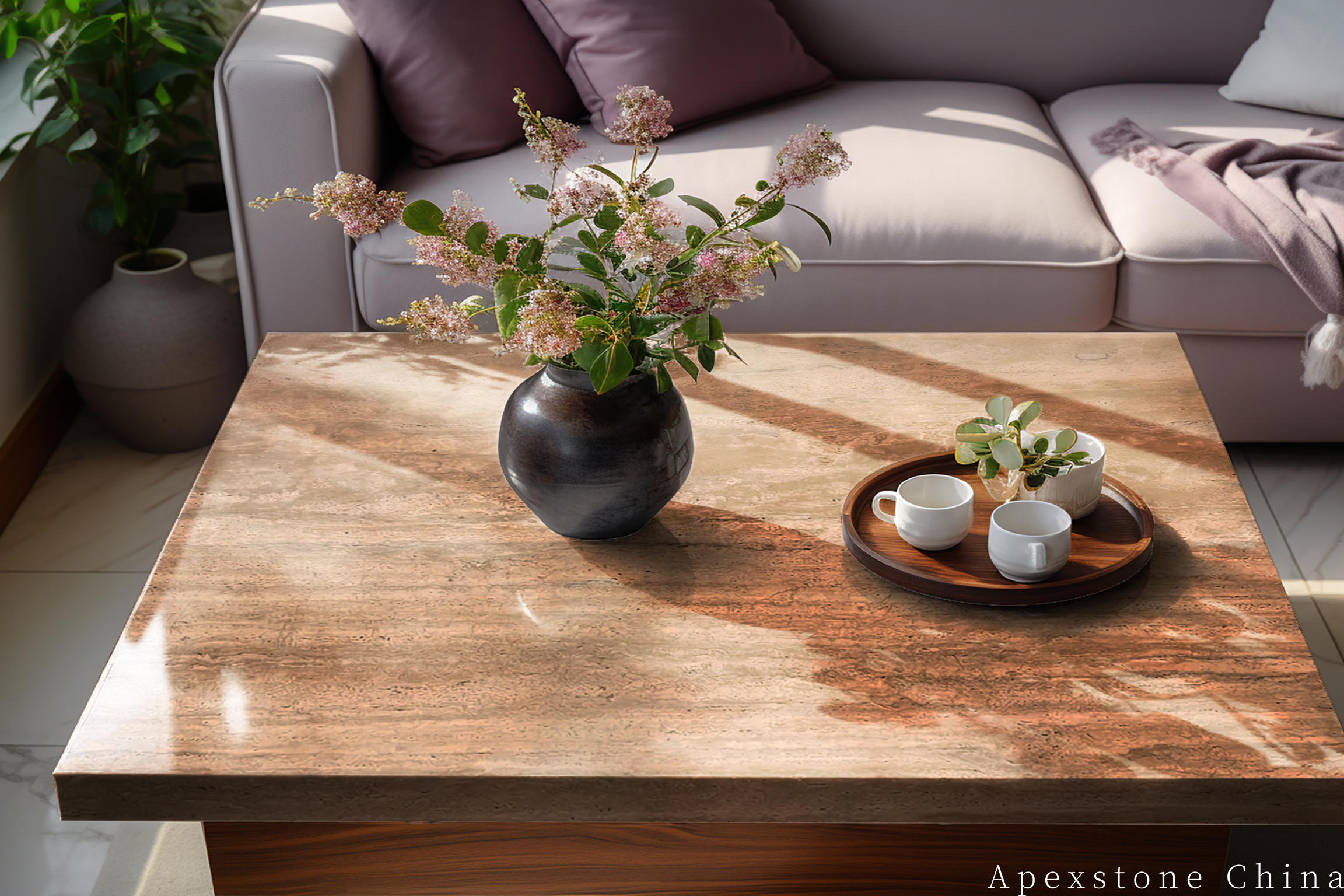
Timber & Muted Colour
ملاحظات الألوان
أربعة عناصر تحكم للوحة ألوان متناسقة
اختر الأبيض الدافئ، وليس الأبيض المزرق
الأبيض المزرق قد يجعل الترافرتين الدافئ يبدو أصفر بشكل غير متوقع. ابدأ بدرجات الطباشير أو العاجي أو الجير الناعم وقارنها بعينة محكمة الغلق بالحجم الكامل تحت إضاءة المشروع الفعلية (النهارية والصناعية).
استخدم الخشب لضبط المزاج
خشب البلوط الطبيعي يحافظ على اللوحة فاتحة ومريحة؛ البلوط المدخن أو الجوز يضيف عمقاً؛ الرماد الفاتح يعطي اتجاهاً إسكندنافياً أكثر هدوءاً. تجنب الخشب المصبوغ بالبرتقالي الذي يضخم كل نغمة ذهبية في الحجر.
اجعل تباين المعدن مقصوداً
النيكل المصقول والفولاذ المقاوم للصدأ يبردان اللوحة قليلاً. النحاس القديم والبرونز يعززان الدفء. الفولاذ المسود أو الإطارات الفحمية تخلق تبايناً بصرياً قوياً—من الأفضل تكرارها في خطوط رفيعة بدلاً من الأسطح الكبيرة المهيمنة.
حدد لون الجراوت والحشو من اللوح
الجراوت الأبيض عالي التباين يحول حقل الترافرتين الهادئ إلى شبكة. اختر الجراوت وحشو الراتنج من درجة لون متوسطة في الدفعة المعتمدة، ثم اختبر العزل لأنه قد يغمق لون الحجر والمفاصل معاً.
اتجاهات اللوحة
أربعة تصاميم معاصرة باستخدام نفس الحجر
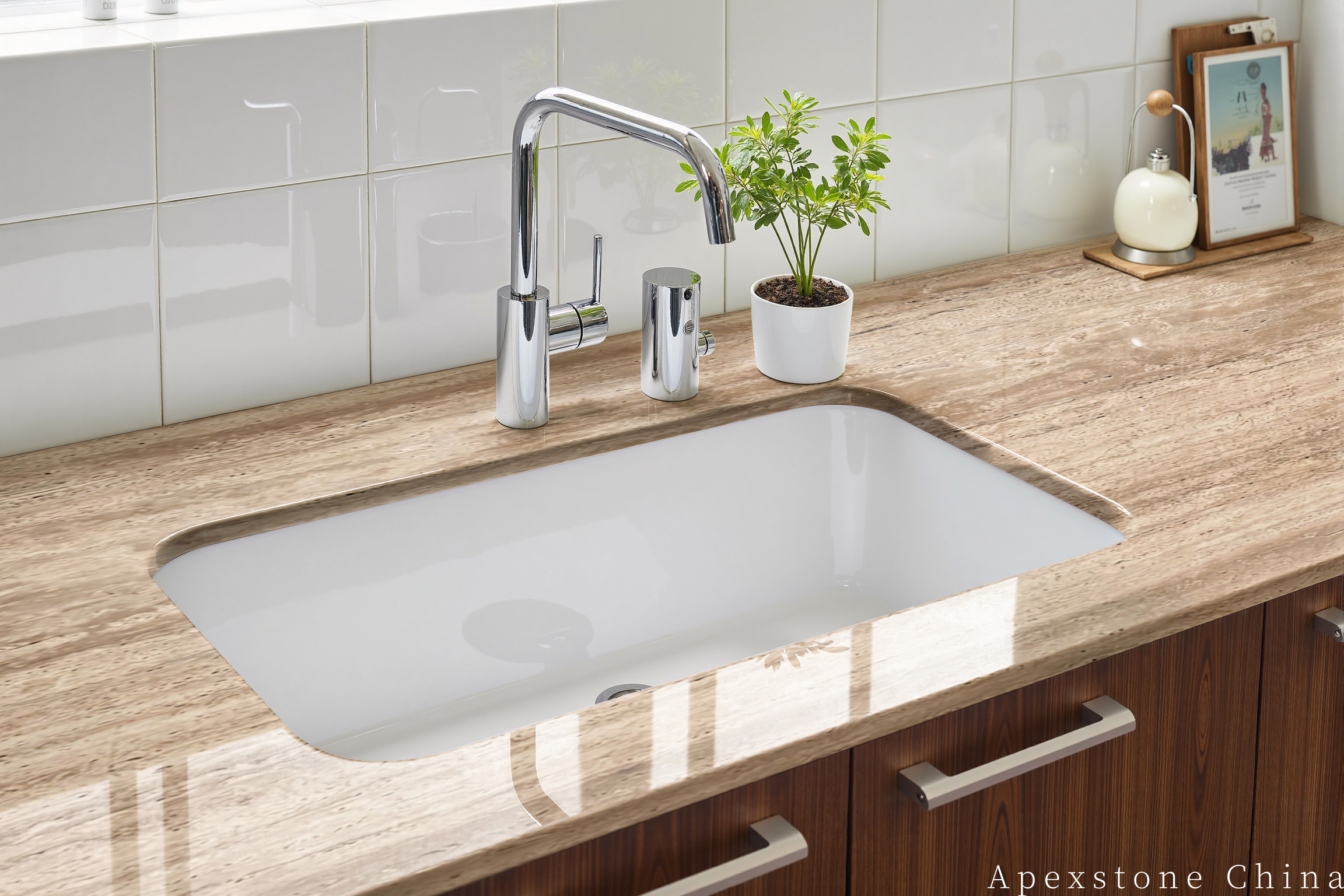
بساطة ناعمة: أبيض دافئ + بلوط فاتح
استخدم ترافرتين معبأ ومُنعّم مع جدران طباشيرية، ونجارة بلوط فاتح، ومنسوجات شوفان، ونيكل مصقول. حافظ على التباين منخفضاً ودع ظلال المسام توفر الملمس البصري.
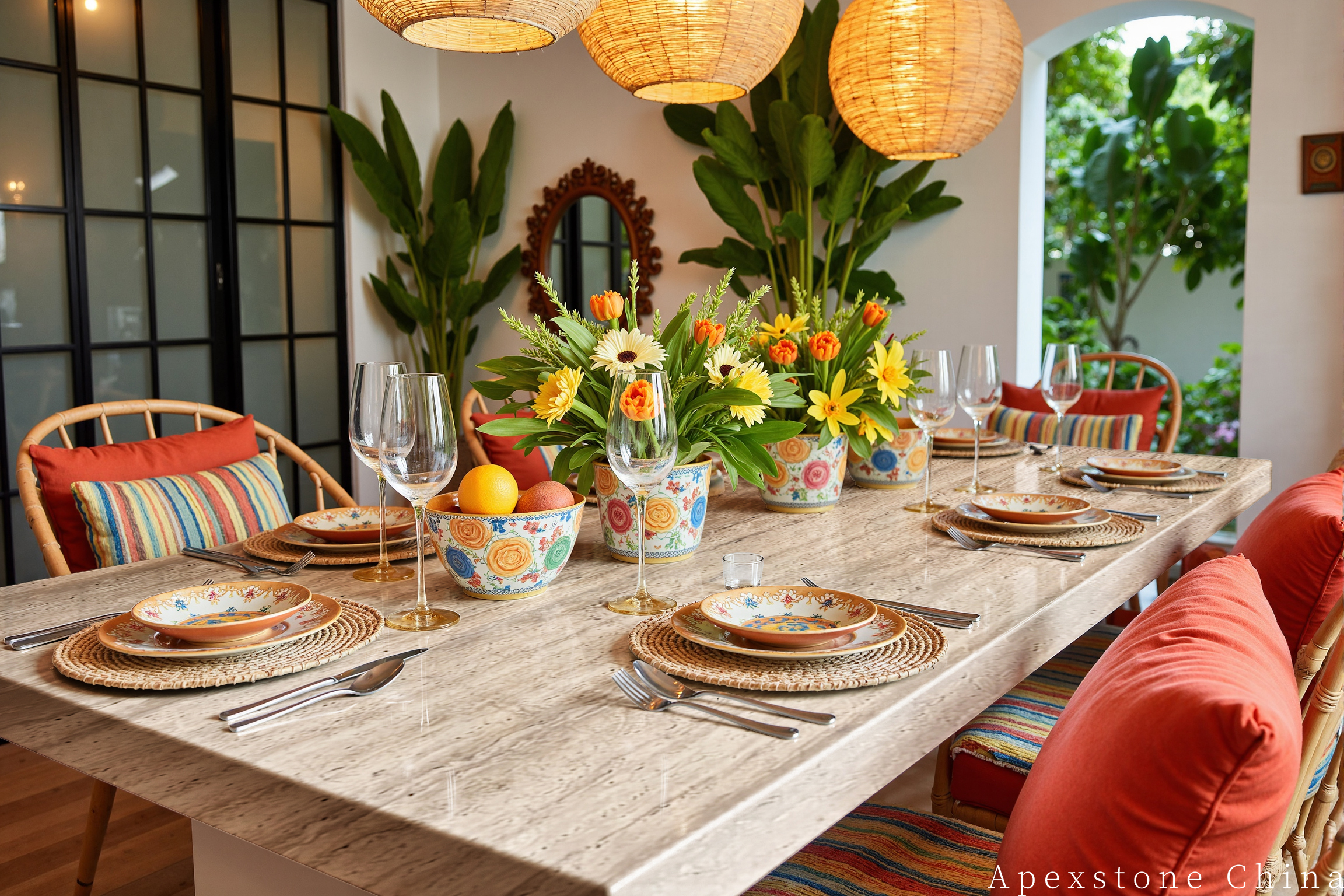
حديث ترابي: طين + جوز + برونز
قم بإقران الحجر مع تيراكوتا هادئ، وجوز، وبرونز عتيق. حدد درجات الطين في التنجيد أو الأعمال الفنية أو جدار جبس واحد للحفاظ على توازن الغرفة.
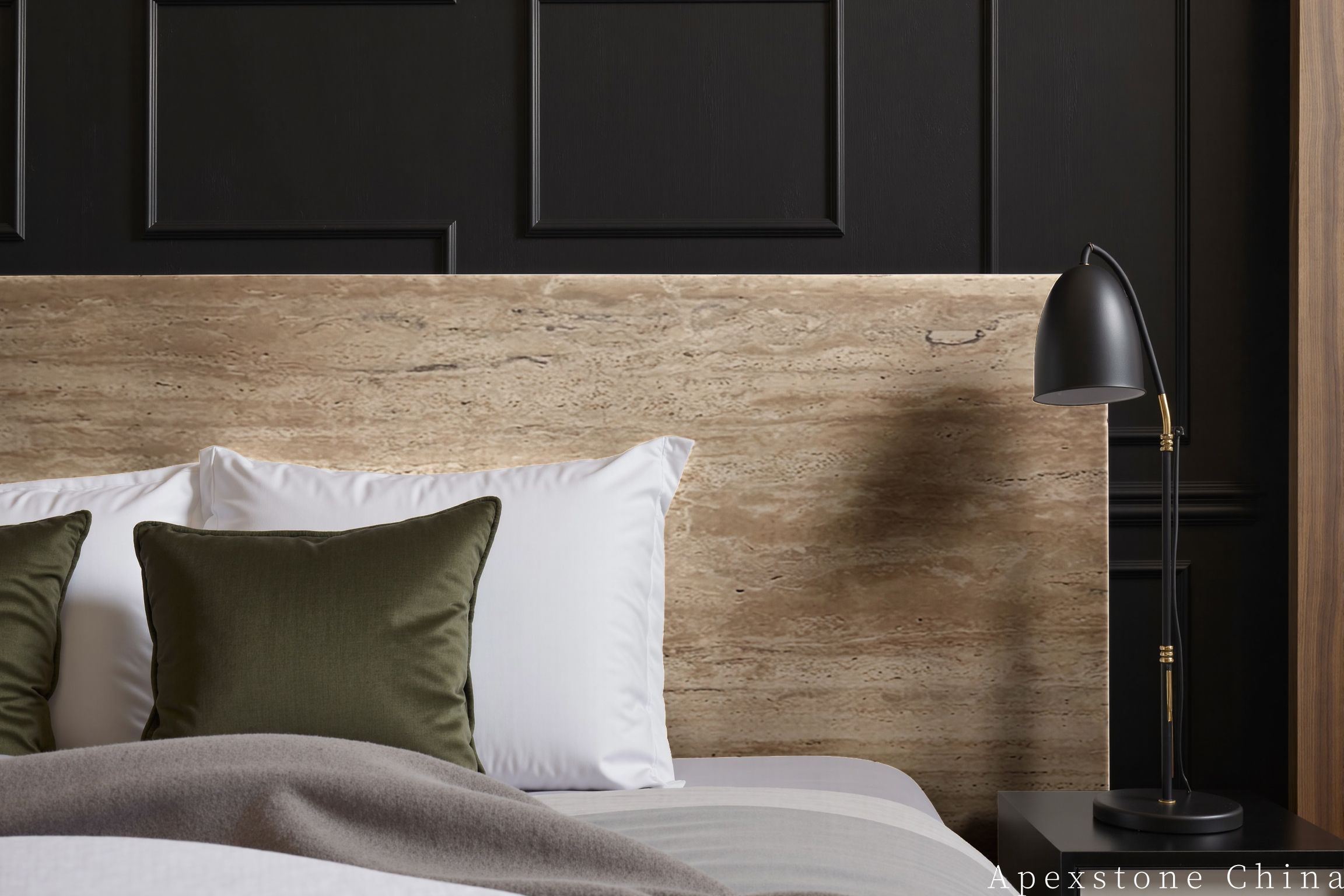
تباين معماري: عاجي + فحمي
اجمع الترافرتين مع العاجي والفحمي والخشب المصبوغ الداكن. التباين يبرز ملامح الحجر دون جعل الغرفة بأكملها ثقيلة بصرياً.
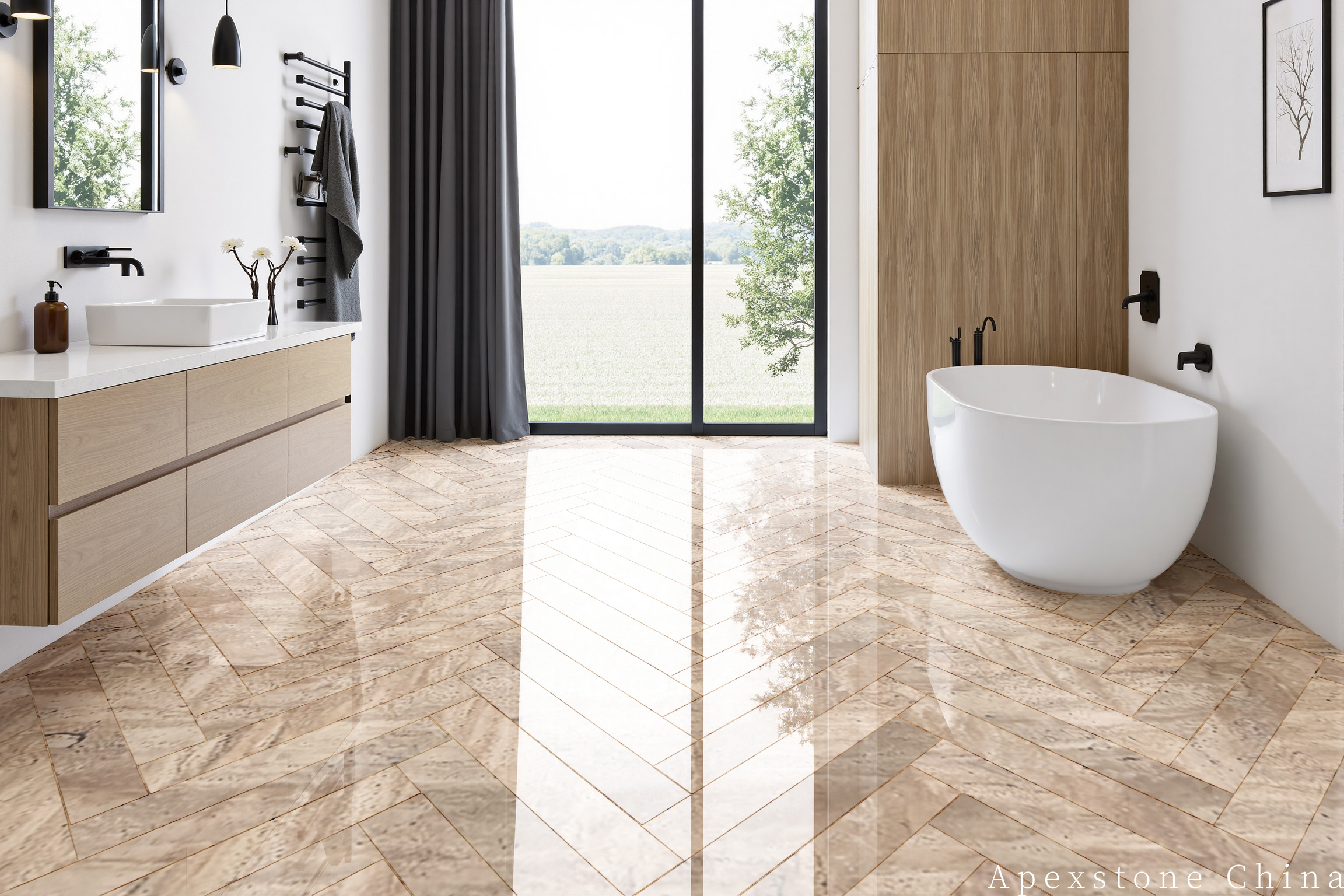
سبا محايد: رملي + كتان + نيكل مصقول
استخدم ترافرتين مُنعّم مع جبس رملي، وملمس كتان، وزجاج شفاف، ونيكل مصقول. طابق الجروت عن قرب واستخدم إضاءة 3000K لمظهر طبيعي هادئ.
لوحة المواد
قائمة تحقق عملية للوحة الألوان
| الدرجة اللونية للحجر | بيج دافئ مع تباين الرمال والقش والبيج الغامق والرمادي الناعم |
| الأبيض المتوافق | أبيض دافئ، طباشيري، عاجي، جير ناعم |
| الدرجات المحايدة المتوافقة | بيج فاتح، معجون، شوفان، رمادي بيج، بيج غامق هادئ |
| مزاوجات الخشب | بلوط طبيعي، بلوط مدخن، جوز، رماد فاتح |
| مزاوجات المعدن | نيكل مصقول، نحاس قديم، برونز، فولاذ مسود |
| ألوان مميزة | زيتوني، طيني، صدئ، فحمي، ميرمية هادئة |
| التشطيب الداخلي الموصى به | مملوء ومصقول للحصول على مظهر معاصر ناعم؛ مملوء وملمع للمساحات الرسمية الأكثر إشراقاً |
| استراتيجية الجراوت | اختر درجة لون متوسطة منخفضة التباين من دفعة اللوح المعتمدة |
| اختبار الإضاءة | راجع عند 2700K و3000K وضوء النهار قبل الموافقة النهائية على الدهان |
| حجم العينة | استخدم عينات حجر محكمة الغلق بحجم 300 × 300 مم على الأقل؛ ألواح كاملة للجدران الرئيسية |
| التحكم في الدفعة | اطلب الأسطح ذات الصلة من دفعة محجر معتمدة واحدة حيثما أمكن |
| تغير الدرجة اللونية بسبب الصيانة | قد تزيد العوازل من عمق البيج وتباين المسام؛ اعتمد النموذج المصغر المحكم الغلق |
سير عمل التصميم
ابنِ اللوحة حول عينة حجر محكمة الغلق
المراجع الرقمية مفيدة للتوجيه، لكن الموافقة النهائية على الألوان يجب أن تتم مع مواد مادية تحت إضاءة المشروع. اتبع التسلسل أدناه قبل إصدار جداول النجارة أو الدهان.
- ✓
اعتمد دفعة اللوح
اختر نطاق البيج المقبول، وكثافة المسام، واتجاه القطع، والتشطيب من ألواح ممثلة.
- ✓
اعزل العينة المرجعية
طبق الحشو والجراوت والعازل المقترحين بحيث تعكس الموافقة اللون النهائي.
- ✓
ابنِ لوحة مواد مادية
ضع عينات الدهان والخشب والمعدن والنسيج والجراوت مباشرة بجانب الحجر.
- ✓
اختبر تحت إضاءة المشروع
راجع اللوحة في ضوء النهار وتحت وحدات الإضاءة المحددة 2700K-3000K؛ وسجل درجة حرارة المصباح المعتمدة.
- ✓
أنشئ نموذجاً مصغراً للغرفة
للجدران أو الأرضيات الرئيسية، قم بتركيب نموذج مصغر متعدد الألواح للتأكد من المفاصل والمدى اللوني وطريقة التنظيف.
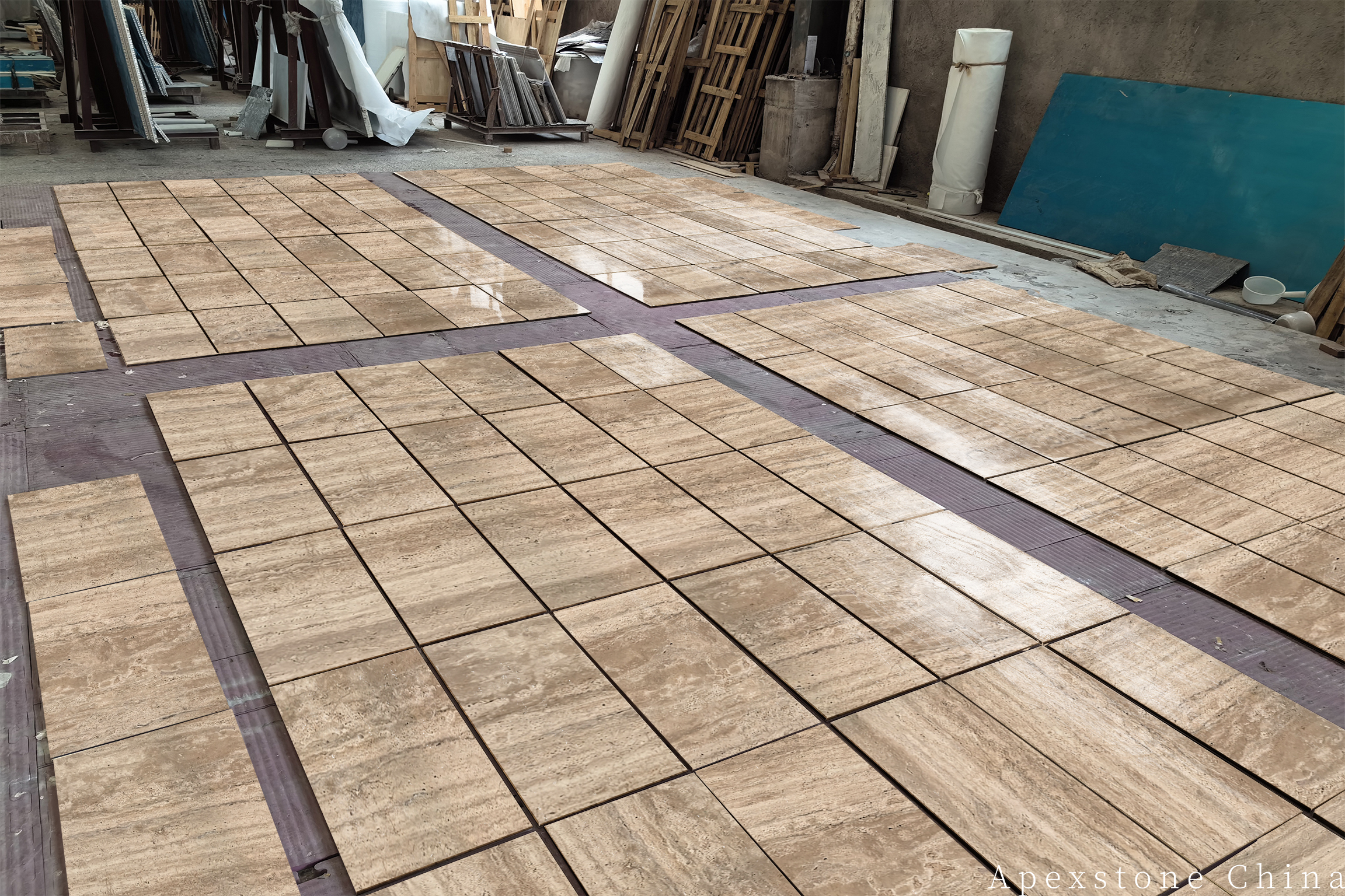
ابنِ لوحة المواد
اختر دفعة الألواح قبل تثبيت لوحة ألوان الغرفة
شارك مراجع الدهان والخشب والمعادن مع درجة حرارة إضاءة المشروع. يمكن لـ Apexstone اقتراح مجموعة من ألواح ترافرتين رومانو وتشطيباتها للمقارنة.